In the world of spreadsheets, Excel stands as a formidable tool for managing and analyzing data. However, the sheer volume of information can sometimes be overwhelming, making it challenging to draw insights at a glance. This is where conditional formatting steps in, transforming a set of numbers into visual information set.
Table of Contents
ToggleIn this blog post, we’ll explore the wonders of conditional formatting in Excel and how it can bring your data to life.
Understanding Conditional Formatting
Conditional formatting allows you to highlight, emphasize, and organize your data based on specific conditions or criteria. Instead of sifting through endless rows and columns, you can let Excel do the heavy lifting, visually representing patterns and trends in your data.
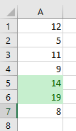
Simply said, conditional formatting allows you to highlight cells with a certain color or icon, depending on the cell’s value.
Steps to Apply Conditional Formatting
1. Select Your Data:
Highlight the cells or range of cells you want to apply conditional formatting to. This could be a column of sales figures, a row of dates, or any set of data relevant to your analysis.
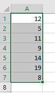
2. Access the Conditional Formatting Menu:
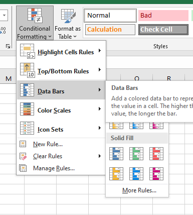
Navigate to the “Home” tab on the Excel ribbon, where you’ll find the “Conditional Formatting” option. Click on it, and a dropdown menu will unveil a variety of formatting options.
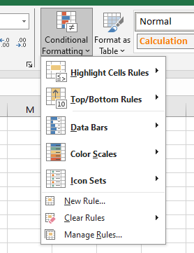
3. Choose Your Formatting Rules:
Excel offers a range of pre-defined rules that cater to different scenarios. Want to spot values above or below a certain threshold? Use the “Highlight Cells Rules” option. Need to identify duplicates or unique values? There are rules for that too. Explore the possibilities and choose the one that aligns with your analysis goals.
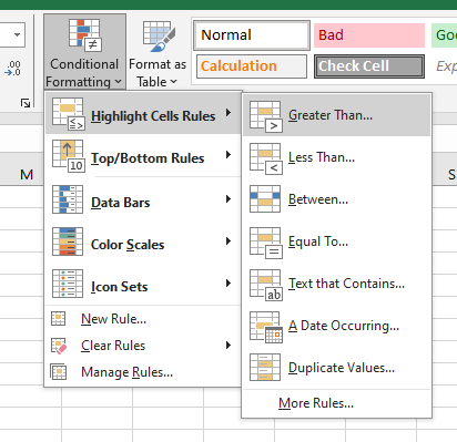
4. Set Formatting Parameters:
Once you’ve selected a rule, a dialog box will appear, allowing you to set the parameters for your chosen formatting. This could involve specifying a particular color, icon set, or data bar style. Excel provides a preview so you can see how your formatting will look before applying it.
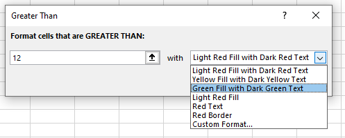
5. Review and Adjust:
After applying the formatting, take a moment to review your spreadsheet. The visual cues will make it easier to identify trends, outliers, or areas that require further investigation. If needed, you can always go back and tweak the formatting parameters to better suit your preferences.
Advanced Conditional Formatting Techniques
While the basic steps outlined above can significantly enhance your data visualization, Excel offers more advanced conditional formatting techniques for those looking to take their skills to the next level:
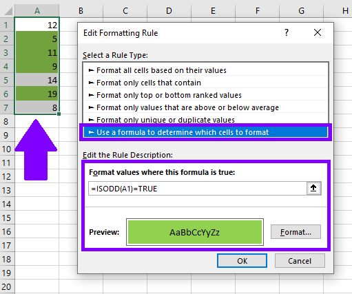
1. Formulas for Custom Rules:
Excel allows you to create custom rules using formulas. This opens up a world of possibilities, enabling you to apply formatting based on complex logical conditions tailored to your specific needs.
2. Color Scales and Data Bars:
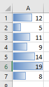
Instead of a simple highlight, experiment with color scales or data bars to represent the magnitude of values. This is particularly useful for visualizing gradients in data, such as sales performance or project timelines.
3. Icon Sets for Quick Insights:
Excel provides a variety of icon sets that you can apply to your data. These icons can represent trends, variances, or status updates, making it easy to interpret information at a glance.
By mastering these techniques, you can bring your Excel sheets to life, making data analysis not just informative but also visually appealing. So, the next time you’re faced with a sea of numbers, let conditional formatting be your guide to uncovering the insights that matter. Happy formatting!


