Power BI offers a variety of visualizations to help you present and analyze your data effectively. In this guide, we’ll cover how to create basic visualizations such as bar charts, line charts, and pie charts in Power BI.
Table of Contents
ToggleCreate New Visualization
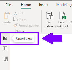
Once you load and check data, you are ready to start creating different visualizations and interactive dashboards. Ensure that your data is properly formatted and structured for analysis, and then navigate to the Report View.
Switch to the “Report View” by clicking on the “Report” tab.

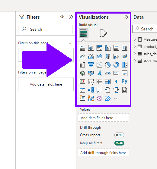
Choose Visualization
In the Visualizations pane on the right-hand side of the screen, you’ll find a variety of visualization types, such as bar charts, line charts, pie charts, and more. Click on the appropriate visualization icon to add it to your canvas.

Visual Types
Power BI offers a variety of visuals, and you should carefully pick the ones which are most appropriate for your data and report goal.
Most commonly used types are:
- Bar Chart: Displays data as rectangular bars, with the length of each bar proportional to the value of the data.
- Line Chart: Connects data points with straight lines, useful for showing trends over time or continuous data.
- Pie Chart: Represents data as slices of a circle, with each slice showing the proportion of a category to the whole.
- Area Chart: Similar to a line chart, but the area beneath the line is shaded, creating a filled-in area between the line and the x-axis.
- Scatter Plot: Plots individual data points on a two-dimensional plane, ideal for identifying relationships and correlations between two variables.
- Waterfall Chart: Demonstrates the cumulative effect of sequential positive and negative values on a running total.
- Map: Visualizes geographical data on a map, with data points plotted based on latitude and longitude values.
- Card: A simple visualization that displays a single value, such as a KPI (Key Performance Indicator).
- Table: Presents data in tabular form, showing individual rows and columns of data.
Add Data
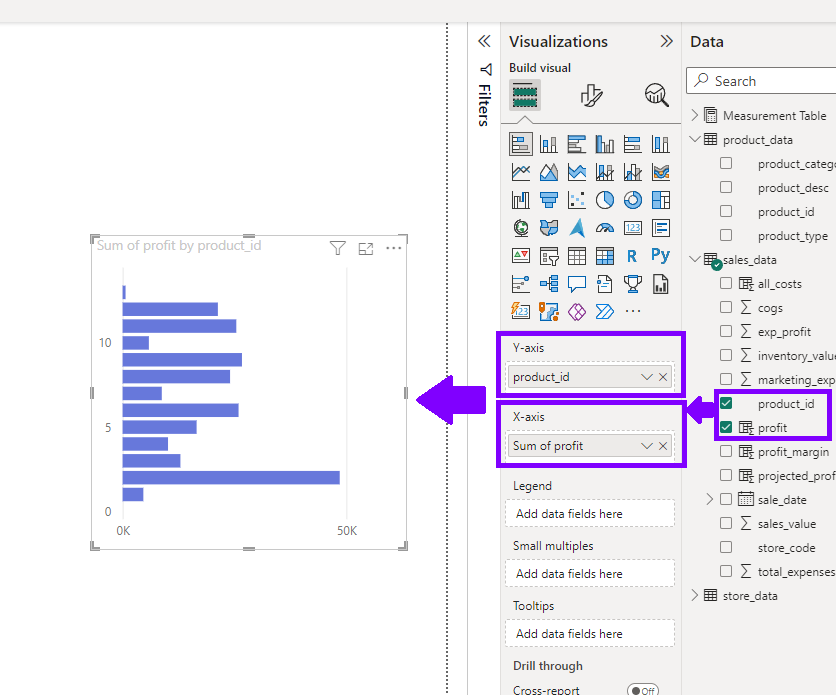
Drag and drop the fields from your data tables into the respective fields of the selected visualization.
For example, for a bar chart, place the categorical data (e.g., product_id) in the “Y-axis” field and the numerical data (e.g., profit) in the “X-axis” field.

After writing the formula, press Enter to create the calculated column. Power BI will compute the calculated values for each row in the table based on the formula you provided.
Customize the Visualization
Use the “Format Visual” pane to customize the appearance and behavior of the visualization. Adjust properties like colors, labels, data labels, titles, axis formatting, and more to match your data visualization requirements.

By following these steps, you can easily create basic visualizations like bar charts, line charts, and pie charts in Power BI. Use these visualizations to convey your data insights effectively and make informed decisions based on your data analysis. Power BI’s interactive features provide a dynamic experience, allowing you to explore and interact with your data for a more comprehensive understanding of your business metrics.

