In the world of data-driven decision-making, presenting complex information in an easily digestible and interactive manner is a skill that can set you apart. Interactive reports and dashboards, the cornerstones of Power BI, allow you to not only convey your data but also empower your audience to explore, analyze, and glean actionable insights on their terms. In this comprehensive guide, we’ll dive into the intricacies of creating interactive data presentations that captivate your audience and drive data-backed decisions.
Table of Contents
ToggleStep 1: Import and Connect Data Sources
Start by launching Power BI Desktop and click on “Get Data” to import your data source – whether it’s a database, CSV, Excel file, or an online service.
Now, shape and transform your data using Power Query Editor, ensuring it’s ready for visualization. You should carefully analyze available data tables and prepare your data and establish relationships between tables if necessary.
Step 2: Designing Visualizations
Once you prepared data, next step should be defining which visualizations you will use and prepare overall design of dashboard.
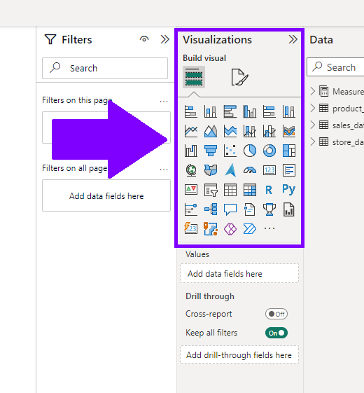
Navigate to the “Visualizations” pane, your creative canvas. Choose the perfect chart type – bar charts, line graphs, pie charts, and more – that best conveys your data and report goal you wish to achieve. Drag and drop fields from your data tables onto your chosen visualizations.

Choose appropriate colors and formatting to draw attention where it matters.
Step 3: Add Interactivity
It is time to harness the power of slicers and filters from the “Visualizations” pane to put the user in control. These interactive elements allow users to tweak and refine their data view, transforming passive observation into active engagement and data exploration.
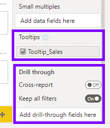
In addition, consider creating drill-through actions. Define fields and measures that users can delve into for deeper insights within “Drill Through” field of selected visualization.

Employ tooltips to provide instant context, and introduce dynamic measures that adapt based on user selections.
Step 4: Utilize Bookmarks
Bookmarks are an extremely useful feature which allows you to further improve interactivity of your reports.
Save specific configurations of visuals, filters, and drill-through actions as bookmarks. These bookmarks become are like different states and stages of your report, allowing users to navigate through different angles of the data story.
You can find Bookmarks within View tab.

Step 5: Publish and Share
Once your interactive report is ready, save your Power BI Desktop file. Publish your creation to the Power BI Service, enabling others to access and explore your insights. Share your report with stakeholders, granting them access or embedding it into web pages or applications.
Interactive reports and dashboards in Power BI are more than just data displays; they are platforms for storytelling and insight discovery. By following this comprehensive guide, you’ll unlock the power of interactive data presentations, captivating your audience, fostering exploration, and driving informed decisions. Embrace the potential of Power BI and transform your data into a compelling narrative that guides your organization toward success.

