Formatting options in Power BI allow you to fine-tune the appearance of your visualizations, making them more visually appealing, intuitive, and informative. By customizing colors, labels, data points, and other elements, you can effectively communicate insights and emphasize key findings in your data. Here’s a guide on how to enhance your visualizations using formatting options in Power BI.
Table of Contents
ToggleCustomize Visual Appearance
Begin by clicking on the visualization you want to format. When selected, the Visualization pane on the right side of the Power BI interface will display options specific to the chosen visualization.
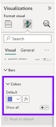
Colors
In the “Format” section of the Visualization pane, you can adjust the color scheme of your visualization. Choose from various color palettes or define custom colors to match your report’s theme. Consistent and visually appealing color choices help users understand patterns and associations in the data.

Data Labels
Toggle data labels on or off to display actual data values on your visualizations. You can format data labels to show different formats (e.g., currency, percentage) and adjust their position to avoid clutter.

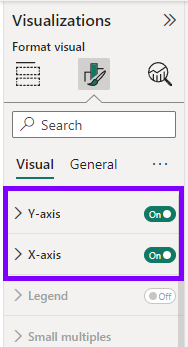
Axis Titles
Customize axis titles to give context to your data. Use descriptive titles that provide clarity on the data represented on each axis.

Legend
Format the legend to help users interpret the meaning of different elements in the visualization. Adjust the position and orientation of the legend to prevent it from overlapping with the data.

Background and Borders
Modify the background color and border of your visualizations to enhance contrast and readability. You can also control the transparency level of elements. You will find them within “Effects” in General part of Format pane.

Themes
Themes are a powerful feature in Power BI that allow you to apply consistent formatting and branding across your entire report. They enable you to customize the appearance of visualizations, text elements, and backgrounds, making your report visually appealing and professional. By using themes, you can create a cohesive look and feel for your report and save time by applying the same formatting across multiple pages and visuals.
A theme is a predefined set of colors, fonts, and visual styles that you can apply to your entire report. Power BI comes with a selection of built-in themes, and you can also create custom themes to match your organization’s branding or report requirements.
To apply a theme:
- Go to the “View” tab in the Power BI Desktop ribbon.
- Click on the “Themes” dropdown menu.
- Choose a built-in theme or click on “Customize current theme” to create a custom theme.

Once a theme is applied, all visuals, backgrounds, and text elements in your report will adopt the theme’s formatting. This creates a consistent look throughout the report, enhancing readability and ensuring a polished presentation.
With leveraging formatting options, you can transform basic visualizations into engaging and compelling data stories. Remember to consider your audience’s preferences and the goals of your report while formatting your visuals. Consistent and thoughtful formatting enhances the visual appeal of your report, making it easier for users to understand and interpret your data insights in Power BI.

