Modifying chart elements in Excel allows you to customize and enhance the appearance and functionality of your charts. You can make adjustments to various elements such as the chart title, axis labels, data labels, legend, gridlines, and more. That way you can create charts that are both visually appealing and able to provide valuable information to users.
1. Select the chart that you want to modify. Click on any part of the chart to activate it.
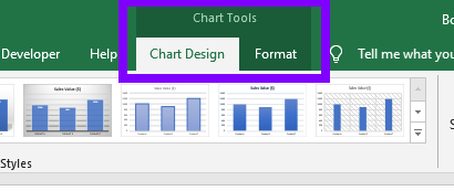
2. The “Chart Tools” tabs will appear in the Excel ribbon. It consists of: “Chart Design” and “Format” tabs (available options are different depending on the version of Excel).

3. Use the “Chart Design” tab to make overall changes to the chart layout and style. Here are some options you can explore:
Chart Styles: Choose from different predefined chart styles to quickly change the overall appearance of the chart.
Chart Layouts: Experiment with different chart layouts to modify the arrangement and positioning of chart elements.
Change Chart Type: Change the type of your chart by picking the appropriate chart type from available options.
Move Chart: Easily move your chart to one of the existing sheets or to a completely new sheet.
4. Use the “Format” tab to make detailed formatting adjustments to individual chart elements. In top left corner you can select which chart element you would like to edit.

Here are some formatting options available:
Shape Styles: Apply different visual styles to the chart elements, such as fills, borders, and effects.
WordArt Styles: Customize the appearance of text elements in the chart, including font style, size, color, and effects.
Continue experimenting and adjusting various elements until you achieve the desired appearance and functionality for your chart.
Modifying chart elements allows you to tailor the visual presentation of your data and communicate insights more effectively. By customizing titles, labels, legends, and other elements, you can enhance the clarity and impact of your charts. Remember to save your changes and review the chart to ensure it accurately represents your data and conveys the intended message.

