In Excel, you have the flexibility to change the chart type to better visualize your data and convey your message effectively. Excel offers a variety of chart types, including column charts, line charts, pie charts, bar charts, area charts, scatter plots, and more.
Table of Contents
ToggleHow to change Chart Type?
1. Select the chart that you want to change. Click on any part of the chart to activate it.
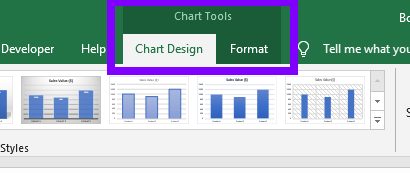
2. The “Chart Tools” tabs will appear in the Excel ribbon. It consists of: “Chart Design” and “Format” tabs (available options are different depending on the version of Excel).
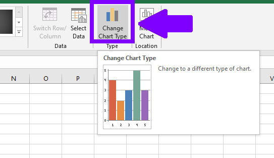
3. Go to the ” Chart Design” tab. In the “Type” group, you’ll find the “Change Chart Type” button.
4. Click on the “Change Chart Type” button. The “Change Chart Type” dialog box will appear.
5.In the dialog box, you’ll see a list of available chart types on the left and a preview of the selected chart on the right
6. Select the desired chart type from the list. As you select each chart type, you’ll see a preview in the right pane.
7. Customize the chart type as needed. You can modify various options such as data series, axes, labels, and other formatting settings.
8. Once you have made the necessary changes, click the “OK” button to apply the new chart type to your selected chart.
Available Chart Types
Column Chart: Displays data in vertical columns, suitable for comparing values across different categories.
Bar Chart: Similar to a column chart, but with horizontal bars instead of vertical columns.
Line Chart: Connects data points with straight lines, useful for showing trends and changes over time.
Pie Chart: Represents data as slices of a pie, ideal for illustrating proportions or percentages.
Area Chart: Similar to a line chart, but the area between the line and the X-axis is filled, making it easier to see the overall magnitude of values.
Scatter Plot: Shows the relationship between two variables as points on a graph, helpful for identifying correlations or trends.
Bubble Chart: Extends the scatter plot by adding a third data dimension represented by the size of the bubbles.
Radar Chart: Displays data on multiple axes originating from a central point, suitable for comparing values across different categories.
Stock Chart: Specifically designed for tracking the fluctuation of stock prices over time, including high, low, open, and close prices.
Surface Chart: Represents data in a three-dimensional format, suitable for visualizing data with multiple variables.
Doughnut Chart: Similar to a pie chart but with a hollow center, ideal for comparing data categories while also displaying the overall composition.
Waterfall Chart: Illustrates the cumulative effect of positive and negative values, often used for financial or project analysis.
Histogram: Displays the distribution of data across different ranges, helping to visualize frequency or probability distributions.
Combo Chart: Combines two or more chart types, allowing you to display different data series in a single chart.
Changing the chart type allows you to experiment with different visual representations of your data, helping you highlight patterns, trends, and relationships. Choose the chart type that best suits your data and the insights you want to convey. Remember to review and adjust the chart as needed to ensure it accurately represents your data and effectively communicates your message.